

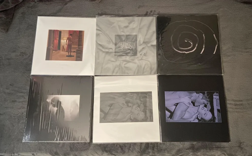
Whirr is a shoegaze band from Modesto, California known for their heavy, swirling guitar work, melancholic tones, and emotionally distant yet intimate vocals. Since forming in 2009, the band has become a cornerstone of modern shoegaze.
Sonically dense yet emotionally piercing.
Blending elements of grunge, noise rock, and dream pop, Whirr’s music creates a wall of sound that’s both crushing and hypnotic. Their discography showcases a band unafraid of experimentation while remaining deeply rooted in a unique and cohesive sound identity.
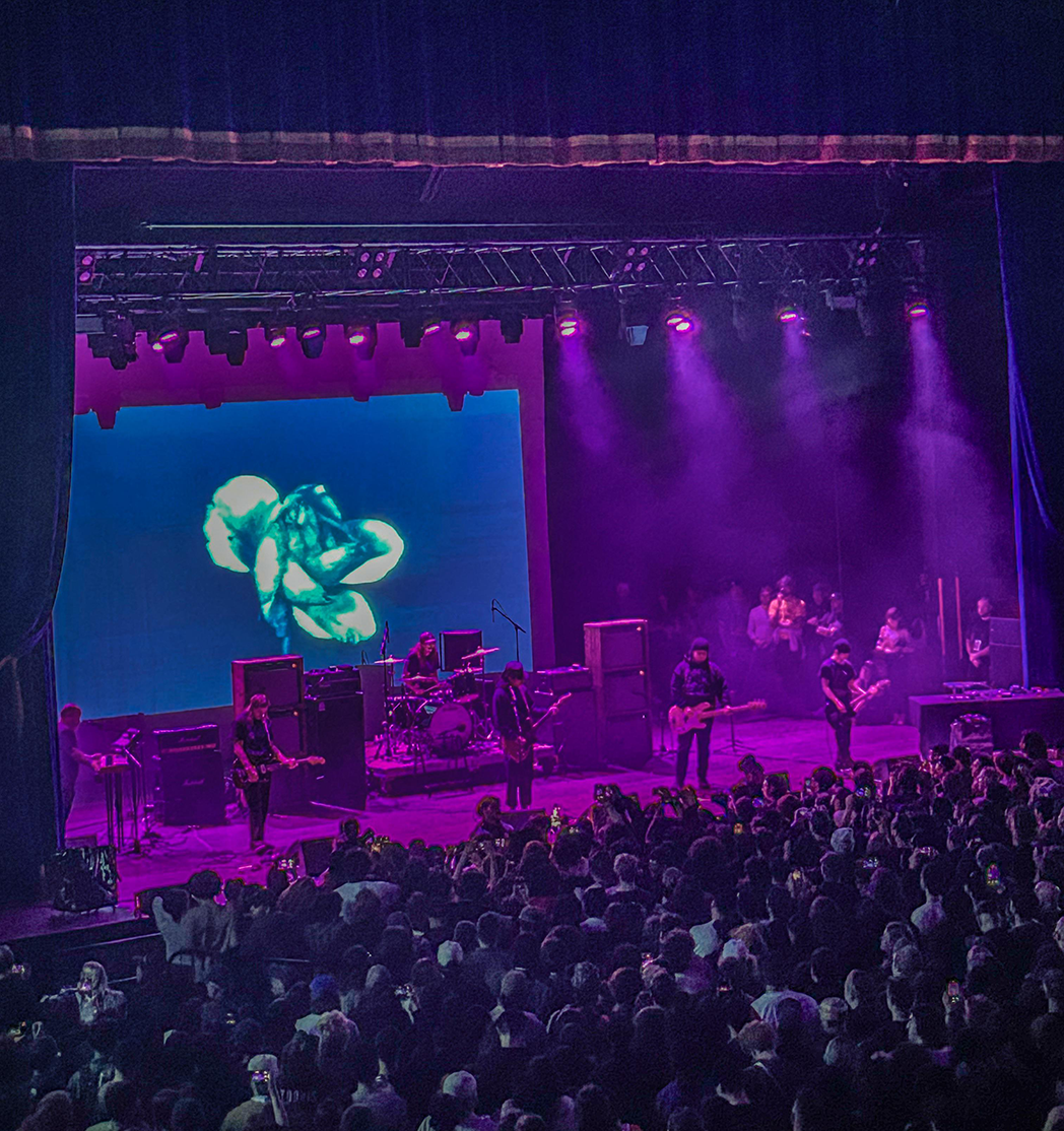
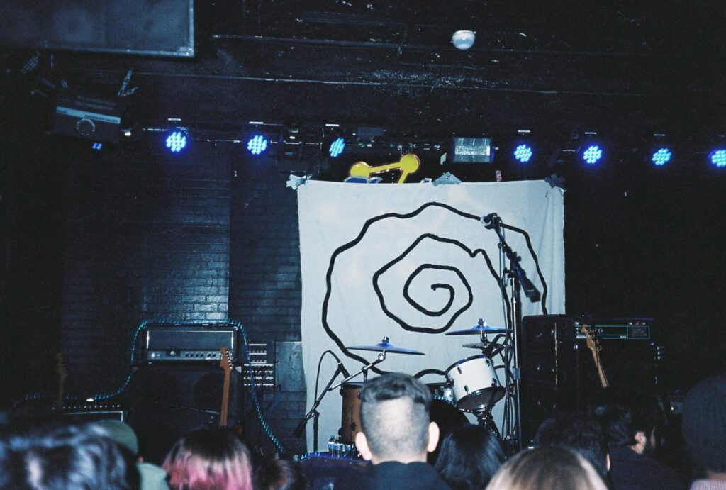
Photo by MusicallyMeditated.
Establish a visual tone that prepares the audience emotionally…
My artwork blends minimalism with inspired textures, aiming to reflect the mood and emotion of each release.
As the best friend of, and go-to designer for Whirr, my role has been to visually articulate the band’s sound; textured, atmospheric, and emotionally raw.
Drawing from the sonic weight of shoegaze and post-punk, my artwork blends minimalism with inspired textures, aiming to reflect the mood and emotion of each release.
From album covers to tour posters and merch, I strive to create cohesive visuals that immerse fans before they even press play.
Each design is built around tone: analog distortions, and photographic abstraction are key elements that echo the band’s dense, reverb-heavy soundscapes.
Whether working with stark photography or layered typographic treatments, my goal is to mirror Whirr’s ethos: beautiful, loud, and punk.
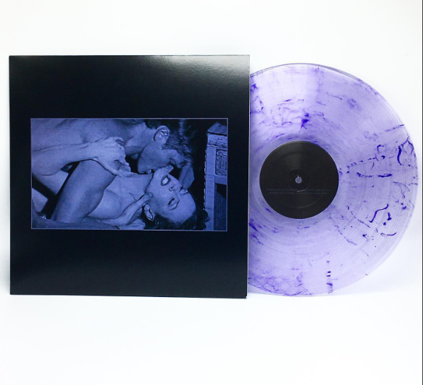
The Beginning:
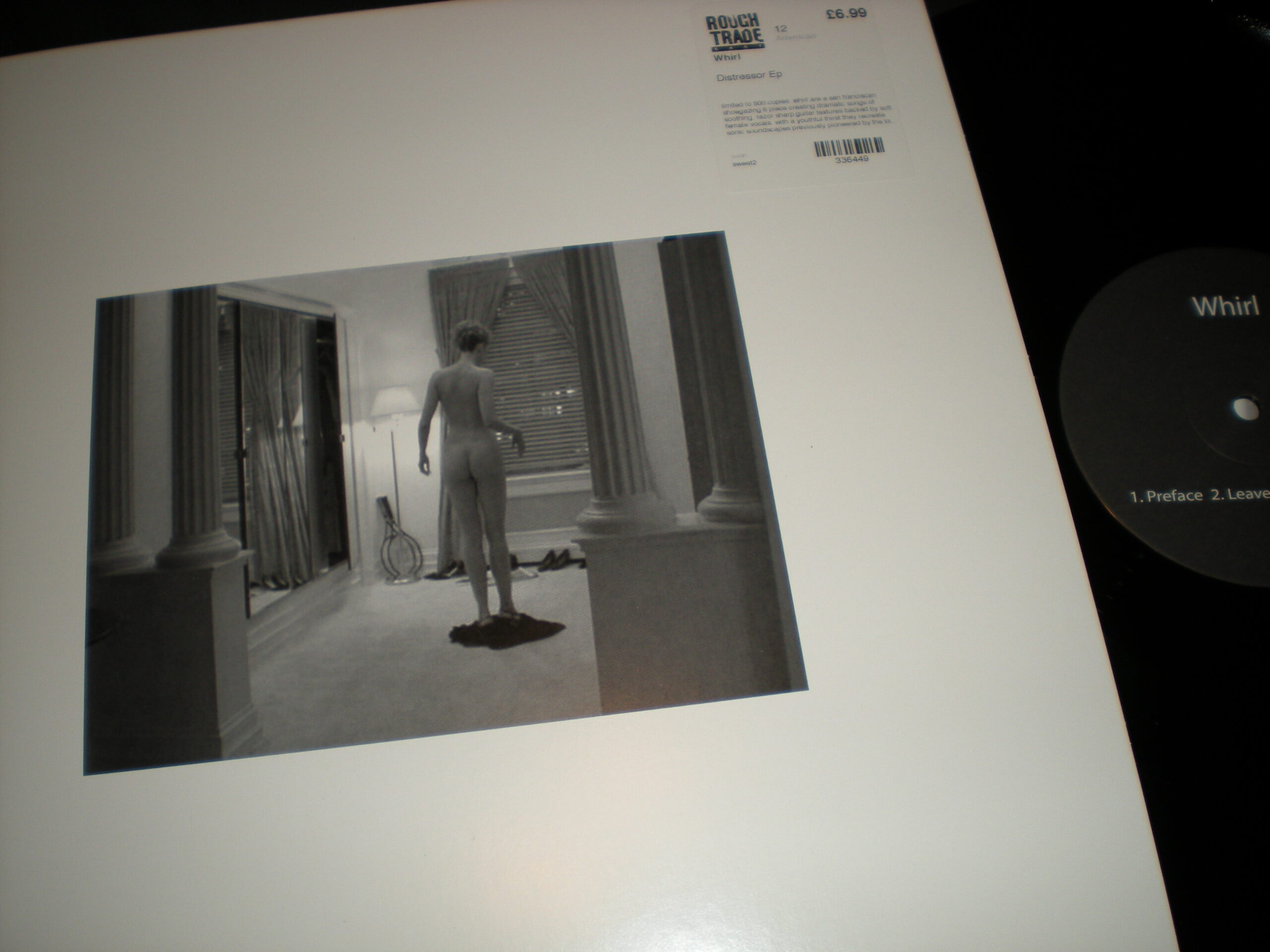
Distressor (2011)
Visual Concept:
The cover of Distressor uses a still from Eyes Wide Shut, capturing a moment of Nicole Kidman’s character, Alice Harford, undressing. The image is quiet and intimate, chosen for its symbolic weight. It represents vulnerability, reflection, and a shedding of the past—an idea that parallels Whirr’s early formation and emotional tone.
The design is minimal and direct. There is no embellishment or clutter, allowing the viewer to sit with the discomfort and intimacy of the moment. That simplicity mirrors the music’s emotional restraint and atmospheric pull. The cover introduces a theme that would carry through future Whirr releases: transformation, detachment, and a kind of quiet intensity that lingers beneath the surface.
The Shift:
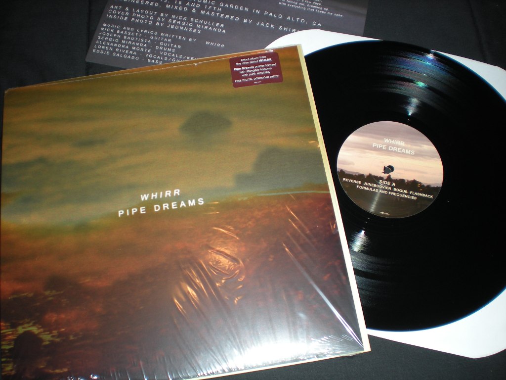
Pipe Dreams (2012 LP)
Visual Concept:
Pipe Dreams marked a sonic leap. More clarity, more volume, more gravity and the visual identity followed suit. The artwork embraced a somber, introspective tone: a muted, cinematic color grade with haunting photographic elements. The layout played with negative space and visual depth to echo the record’s contrast between explosive distortion and melancholic calm. It was a balance between emotional distance and raw vulnerability.
Typography stayed minimal and modern, letting the imagery do the emotional heavy-lifting.
The Mid-Point:
Around (2013 EP)
Visual Concept:
The Around EP was transient and minimal, and the art reflected that fleeting nature. It carried an almost ghostlike quality, subtle motion, and a design that felt more like a memory than a statement. The artwork leaned heavily into atmosphere over detail, a visual echo of the EP’s concise, yet immersive, sound. The design avoided narrative and embraced the ephemeral.
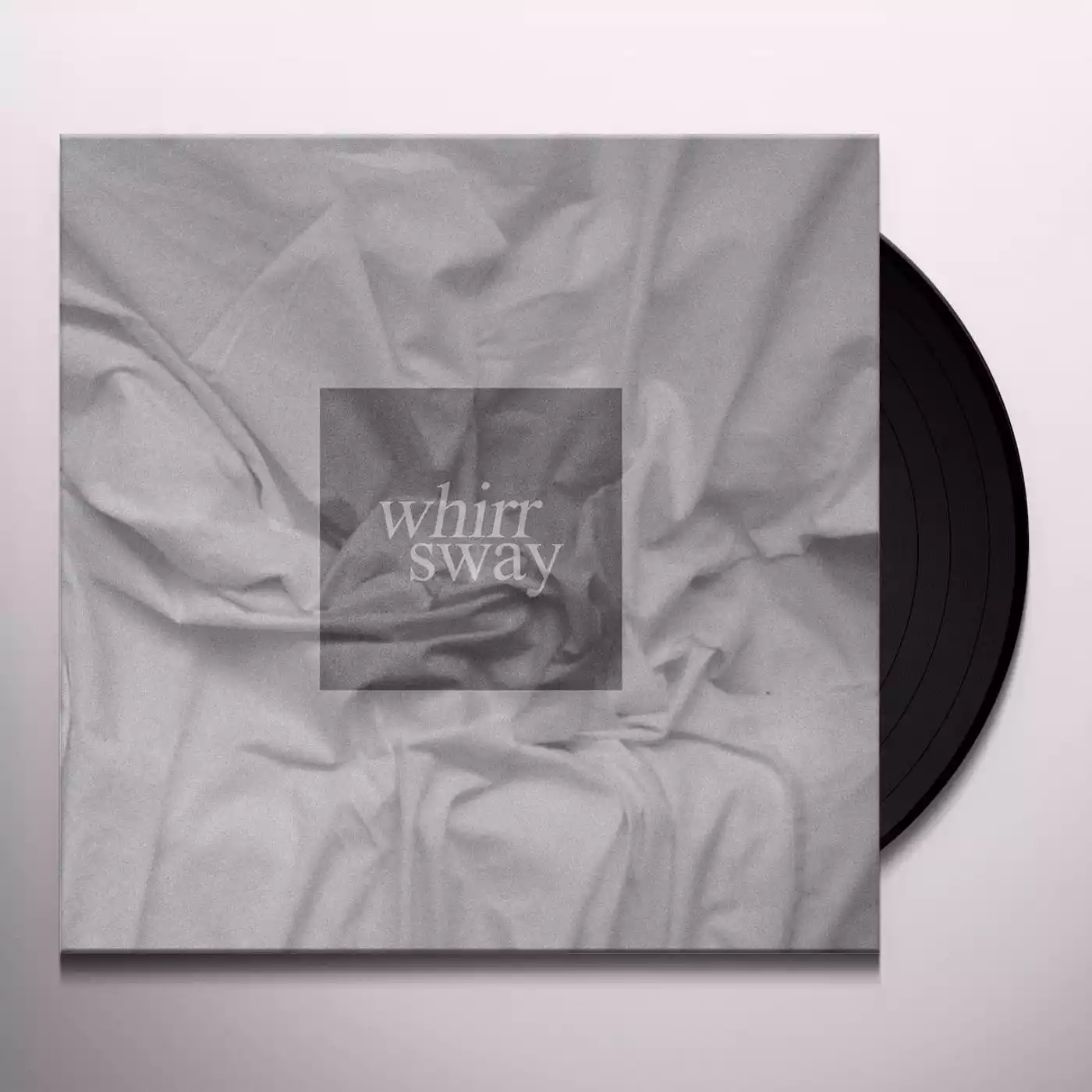
The Change:
Sway (2014 LP)
Visual Concept:
With Sway, Whirr’s sound evolved. Heavier, moodier, more polished and the artwork followed. The visuals became sharper but remained emotionally foggy. The cover used symmetry, restraint, and contrast to reflect the album’s themes of detachment and beauty. The color palette was cold and minimal, paired with stark composition to evoke unease and control. The typography was exact and modernist, underlining a sense of order amidst sonic chaos.
This design also marked a shift toward a more unified visual identity for Whirr, threading together future releases with a consistent tone and aesthetic weight.
The Return:
Feels Like You (2019 LP)
Visual Concept:
Feels Like You was heavier and more emotionally direct, and the artwork captured that urgency. The visuals introduced bold contrast and a tactile, analog grit. There was a sense of decay embedded in the design, grainy textures, smeared tones, and distressed color grades that echoed the album’s darker, denser sound.
The layout harkens back to the first record, Distressor, with minimalist design elements, creating a stark juxtaposition that reflected the record’s themes of loss, obsession, and emotional numbness. There was also a sense of finality in the artwork, signaling the band’s matured voice and heavier presence in the scene.
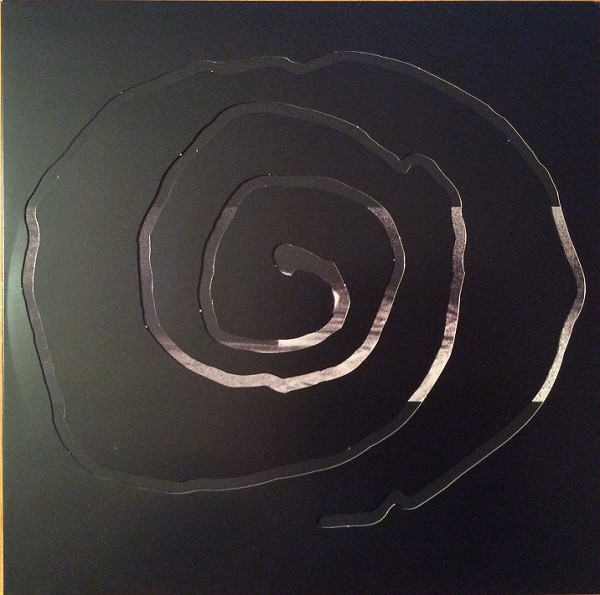
Identity:
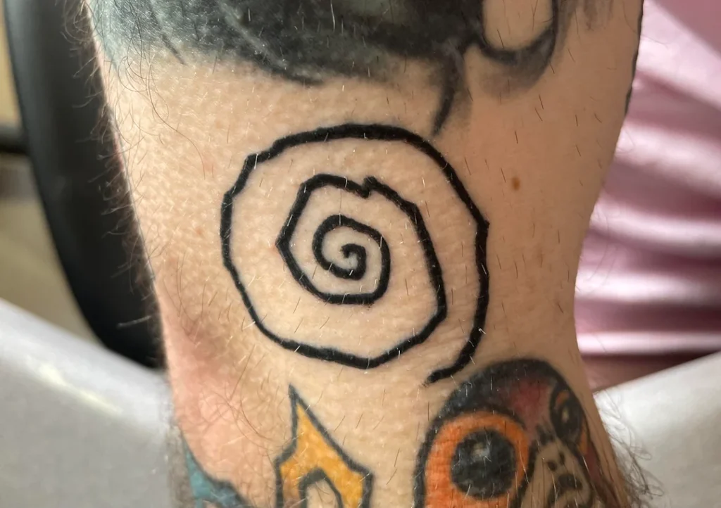
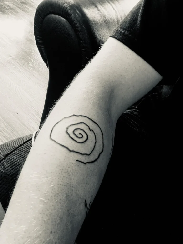
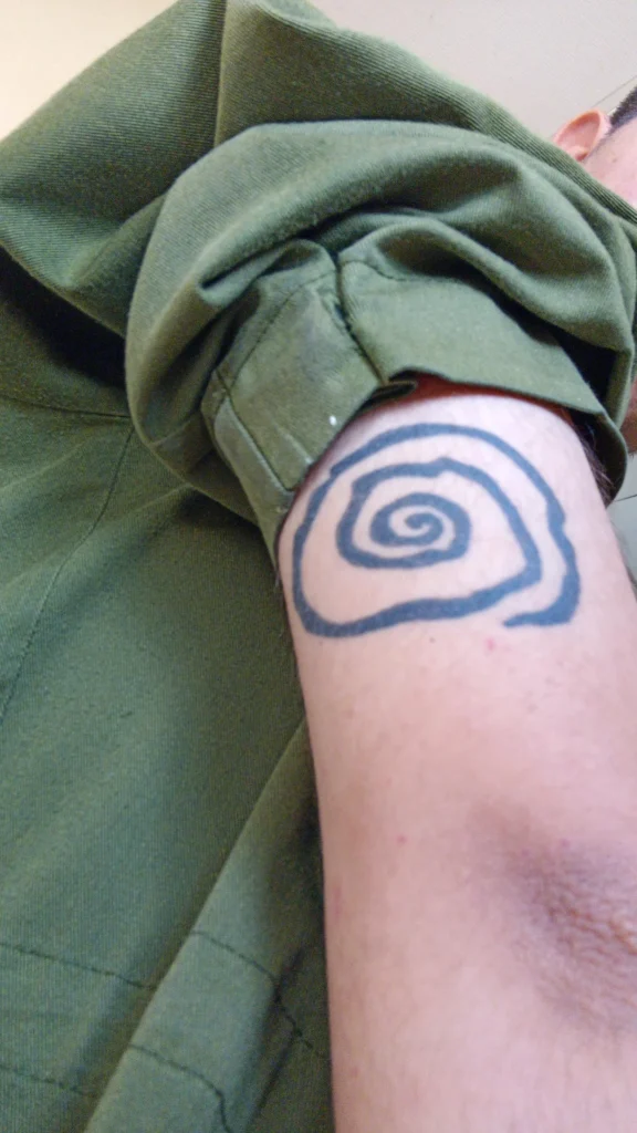
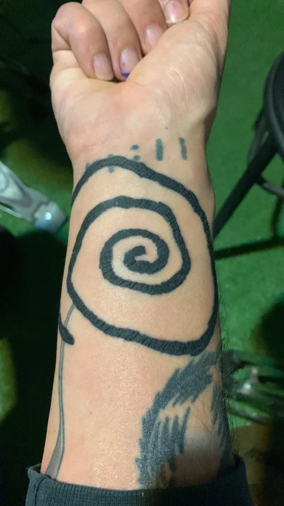
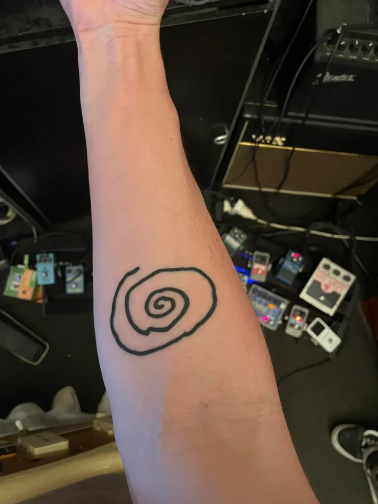
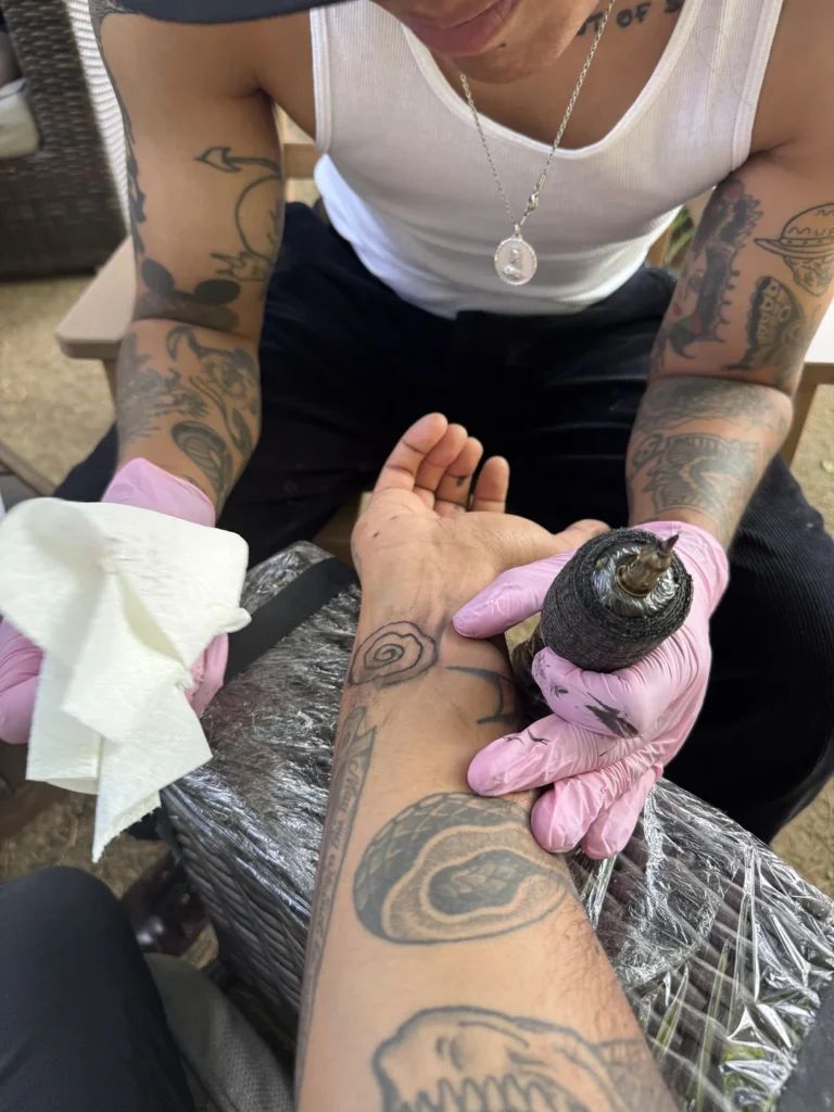
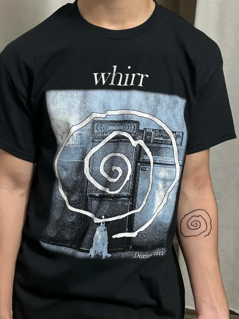
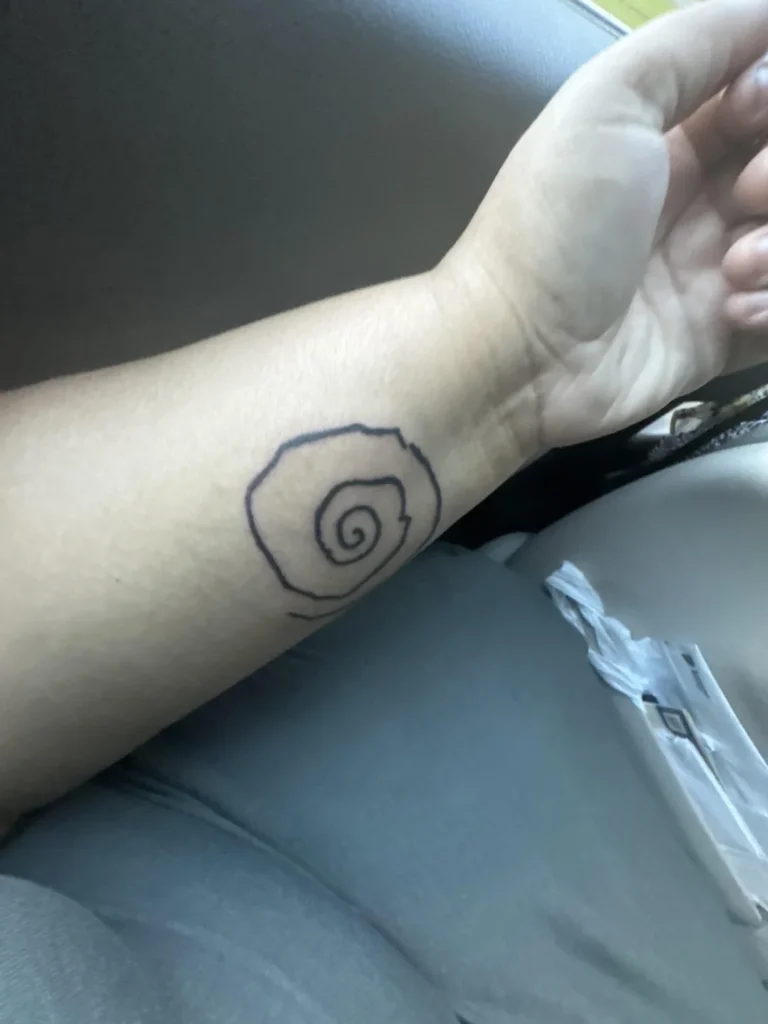
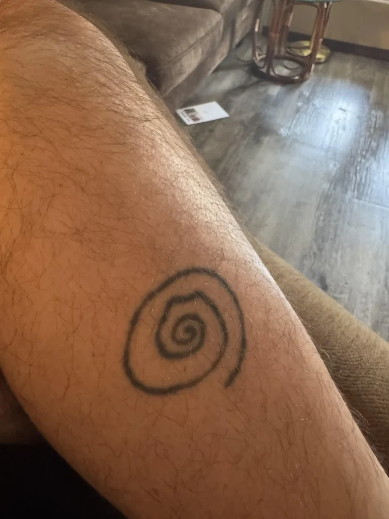
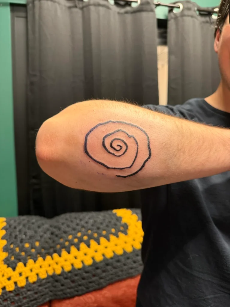
The Swhirl
The Whirr “Swhirl” logo is my hand-drawn design of a chaotic swirl that directly references the band’s original name, Whirl. However, in a twist of fate, when the name changed to Whirr, the symbol took on even more meaning, capturing not only the definition, but the motion and atmosphere of the music. Its simplicity makes it versatile, while the organic form reflects the band’s raw and immersive sound.
It has become a visual shorthand for Whirr’s identity.
I grew up drawing the symbols of other bands I loved. Bands like HIM with the Heartagram, Prince with the Silent Symbol, Black Flag’s Bars, the Slipknot tribal “S” would cover my binder and bedroom walls. It’s been a surreal experience to have a logo I’ve created become that for someone else and not only see people with the logo tattooed on them, but I also get the opportunity to personally tattoo this on those deemed worthy. 😉
Down for life.
 No products in the cart.